Component management
Architecture
The UI library contains all the basic components needed to develop interfaces for the mobile application.
The core package also provides several more specialized components, or those requiring a complex external library (Camera, Scanner, DatePicker, components linked to MailMessages, ...).
The development of these components is based on the principle of Atomic Design. Components are divided into atoms, molecules, organisms and templates:
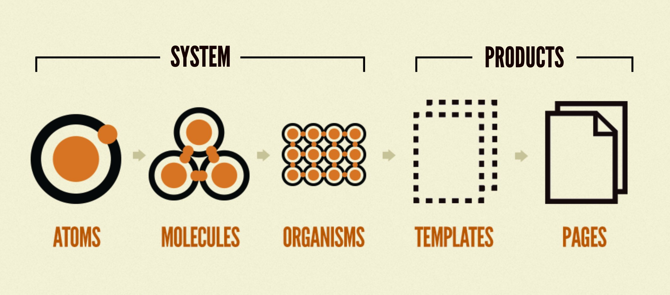
The first three types (atoms, molecules and organisms) correspond to generalist components that can be used in any context. The last type (templates) is used for specialized, empowered components, which have a particular context and sometimes even perform API requests or navigation actions themselves.
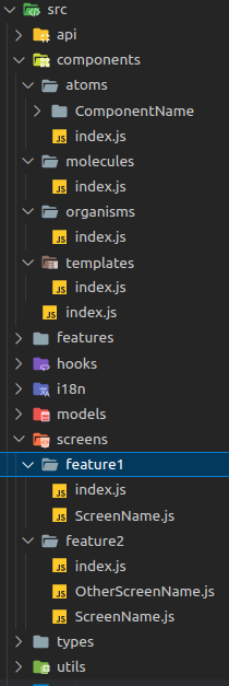
From an architectural point of view, each module must include a components folder with the different types of components present in the module. Each type of component is separated into a dedicated folder, with an index file for exporting components to facilitate their use later.
An index file should also be added to the root of the components folder to centralize the use of components in screens, but also to facilitate exporting. Indeed, components can also be used in other modules that depend on them, so all components must be exported to the index file at the root of the src. folder.
// Index in component type folder
export {default as ComponentName} from './ComponentName/ComponentName';

// Index in components folder
export * from './atoms';
export * from './molecules';
export * from './organisms';
export * from './templates';

//Index in package root
export * from './components';
For each atomic design type, each component must be separated into a dedicated folder. The names of the folder, the file, the component inside and the export must be the same.
Storybook documentation
In order to document the components available in the application, the project has a Storybook with the React Storybook librairy.
When a component is created or modified, the storybook must be updated to keep the documentation up to date. For the moment, the storybook's scope of action is restricted to the UI package.
From an architectural point of view, so as not to overload the compiled sources with useless files, there is a stories folder at the same level as the src folder in the UI package. This folder will contain all the stories in the package.
axelor-mobile/
├── .storybook/ [*Storybook configuration*]
├── packages/
│   ├── ui/
│   │   ├── src/
│   │   └── stories/
│   └── ..
└── ...
Once in the stories folder, components are sorted by type (atoms, molecules, organisms & templates) in the same way as in the package sources.
A story is a component use case. In the storybook, you need to successfully re-create all the component's use cases to enable better documentation. To create a story, you need to create a new file in the stories folder, in the right component category. The nomenclature for the file name is <component name>.stories.tsx .
There can then be two types of stories: fixed stories in the style of a catalog, or customizable stories where the user can modify each attribute to make the combinations of his choice.
import React from 'react';
import {storiesOf} from '@storybook/react-native';
import {Component} from '../../src/components';

storiesOf('ui/<type>/<Component>', module)
  .add('default', () => (
    <Component>
      <View />
    </Component>
  ))
  .add('Text', () => (
    <Component>
      <Text>Text</Text>
    </Component>
  ));
import React from 'react';
import {storiesOf} from '@storybook/react-native';
import {Component} from '../../src/components';

storiesOf('ui/<type>/<Component>', module).add(
  'default',
  args => <Component {...args} />,
  {
    argTypes: {
      propsName: {
        control: {
          type: 'boolean',
        },
        defaultValue: false,
      },
    },
  },
);
It is then possible to add as many fixed stories as required, and also to mix fixed and customizable stories. However, a "default" story must always be added for the storybook to compile correctly. For parametrizable stories, it is possible to add as many atttributes as required.
The different types of argument available:
- no additional configuration required: text, boolean, object
- possibility of adding options: number / range (definition of min, max, step)
- definition of possible values: select / radio
// Number configuration
size: {
  control: {
    type: 'number',
    min: 1,
    max: 10,
    step: 1,
  },
  defaultValue: 1,
},

// Basic select
position: {
  control: {
    type: 'radio',
  },
  options: ['right', 'left'],
  defaultValue: 'right',
},

// Work with the application theme. Don't forget to do the mapping
// afterwards in the component props: color={lightTheme.colors[args._color]}
_color: {
  control: {
    type: 'select',
  },
  options: Object.entries(lightTheme.colors)
    .filter(([, value]) => typeof value !== 'string')
    .map(([key]) => key),
  defaultValue: 'primaryColor',
},
Object fields are not handled very well in the storybook. It's not possible to define the structure of the expected object, and for the user, modifying an object field is rather difficult, as the json object has to be rebuilt in a text editor. In cases where the format of the expected object is known, it is advisable to create an attribute for each expected field of the object and then rebuild the object in the component props. An example with the following object:
// Expected object structure
icon ?: {
    color: string;
    name: string;
}

// Parameters creation for the story
_iconColor: {
  control: {
    type: 'text',
  },
  defaultValue: '#000000',
},
_iconName: {
  control: {
    type: 'text',
  },
  defaultValue: 'qrCode',
},

// Component props mapping
<Component {...args} icon={{name: args._iconName, color: args._iconColor}} />
Some important commands to run in the project root for the storybook :
- open storybook :
yarn storybook - build storybook :
yarn build-storybook
Don't hesitate to look at existing stories when creating a new one, as they already represent a number of use cases that may be useful.
Creating a card
When creating screens, it is often necessary to create a card component. In order to standardize these components and facilitate their creation, the application offers a standard component to which all you need to do is configure the information to be displayed: ObjectCard.
There are two types of card components:
interface TextElement {
  style?: any;
  displayText?: string;
  indicatorText?: string;
  fontAwesome5?: boolean;
  size?: number;
  iconName?: string;
  color?: string;
  isTitle?: boolean;
  hideIfNull?: boolean;
  hideIf?: boolean;
  order?: number;
  numberOfLines?: number;
  customComponent?: ReactElement<any>;
}
The TextElement is used to display textual information in the upperTexts and lowerTexts compartments.
Textual information can be transmitted via the indicatorText and/or displayText attributes, which will display it in bold. It is also possible to define the element as a title (isTitle) in order to display it bold and larger. For titles, the information must be given through the displayText attribute.
The element can be customized with an icon, font size and/or text and icon color.
Finally, a text display can be customized with a different component using the customComponent attribute.
interface BadgeElement {
  style?: any;
  displayText?: string;
  color?: Color;
  showIf?: boolean;
  order?: number;
  customComponent?: ReactElement<any>;
}
The BadgeElement displays information in the upperBadges and lowerBadges compartments.
The text and color of the badge can be customized, using the displayText and color attributes, and a replacement component can be defined using the customComponent attribute.
The card is therefore divided into several compartments, all of which are configurable and optional. The card will only display compartments containing data.
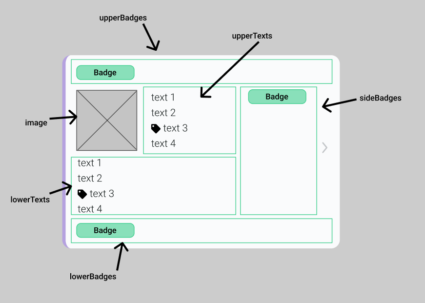
The upperBadges, upperTexts, sideBadges, lowerTexts and lowerBadges compartments take as input structure a list of elements of the right type according to the attribute (TextElement or BadgeElement) as well as a style attribute to customize the container. It's also possible to reverse the display direction of badges in the upperBadges and lowerBadges compartments with the fixedOnRightSide attribute.
The last compartment can contain an optional image, by defining the basic properties of an image:
interface ImageElement {
  source: ImageSourcePropType;
  defaultIconSize?: number;
  resizeMode: ImageResizeMode;
  imageSize?: StyleProp<ImageStyle>;
  generalStyle?: StyleProp<ImageStyle>;
}
To facilitate image integration on cards, the core package provides three utility functions that obtain the URI of an image from AOS according to type:
- useMetafileUri: for formatting a URI from a MetaFile
- useBinaryImageUri and useBinaryPictureUri: for formatting a URI from a binary image.
iOS hot spots
In order to enable support on the iOS platform, there are several points to note and pay particular attention to:
- The elevation style property is not supported on iOS, so the "shadow..." properties must be used. :
elevation: 3,
shadowOpacity: 0.5,
shadowColor: Colors.secondaryColor.background,
shadowOffset: {width: 0, height: 2}, - The zIndex style property doesn't work for nested views, so care must be taken to ensure that all views above it also have a zIndex attribute with a lower value for this to work.
- A new KeyboardAvoidingScrollView component has been created to avoid having to redefine iOS/Android etc. properties for keyboard position. We therefore recommend using this component rather than react-native's KeyboardAvoidingView.
- The dotted or dashed border styles are not supported by iOS, so the behavior must be adjusted for the iOS platform:
borderStyle: Platform.OS === 'ios' ? 'solid' : 'dotted'